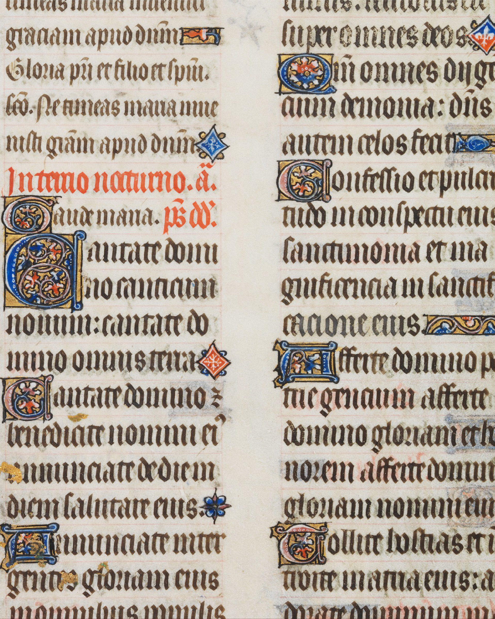
William Morris
British
1834–1896
Kelmscott Press
Visit

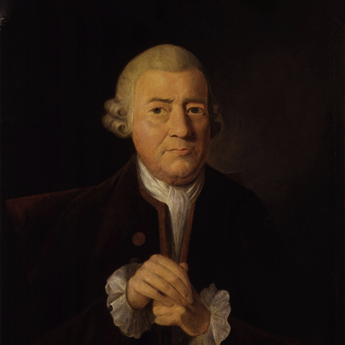
John Baskerville revolutionized 18th-century printing with an obsessive devotion to beauty and clarity. His Baskerville typeface—refined, balanced, and luminous—embodied his pursuit of perfection in form. Beyond type, he pioneered smoother papers and sharper presses, raising bookmaking to an art. Though controversial in his time, Baskerville’s legacy endures in every letter that marries precision with grace.
John Baskerville (1707–1775) was an English printer, type designer, and innovator whose work redefined standards of clarity and refinement in 18th-century publishing. Born near Wolverley, Worcestershire, Baskerville rose from a background in calligraphy and japanning before turning to printing in the 1750s. Dissatisfied with the quality of books available, he developed his own high-contrast typeface, smoother “wove” paper, and improved presses and inks—producing editions of Virgil, Milton, and the Bible noted for their crispness and elegance. His designs initially divided opinion: admired by Benjamin Franklin, but dismissed by some contemporaries as too stark. Over time, however, Baskerville’s influence proved profound, inspiring modern type design and cementing his name in typographic history.
At a Glance
Behind every typeface is a journey. This story map traces the events, relationships, and ideas that shaped the designer’s life and work.