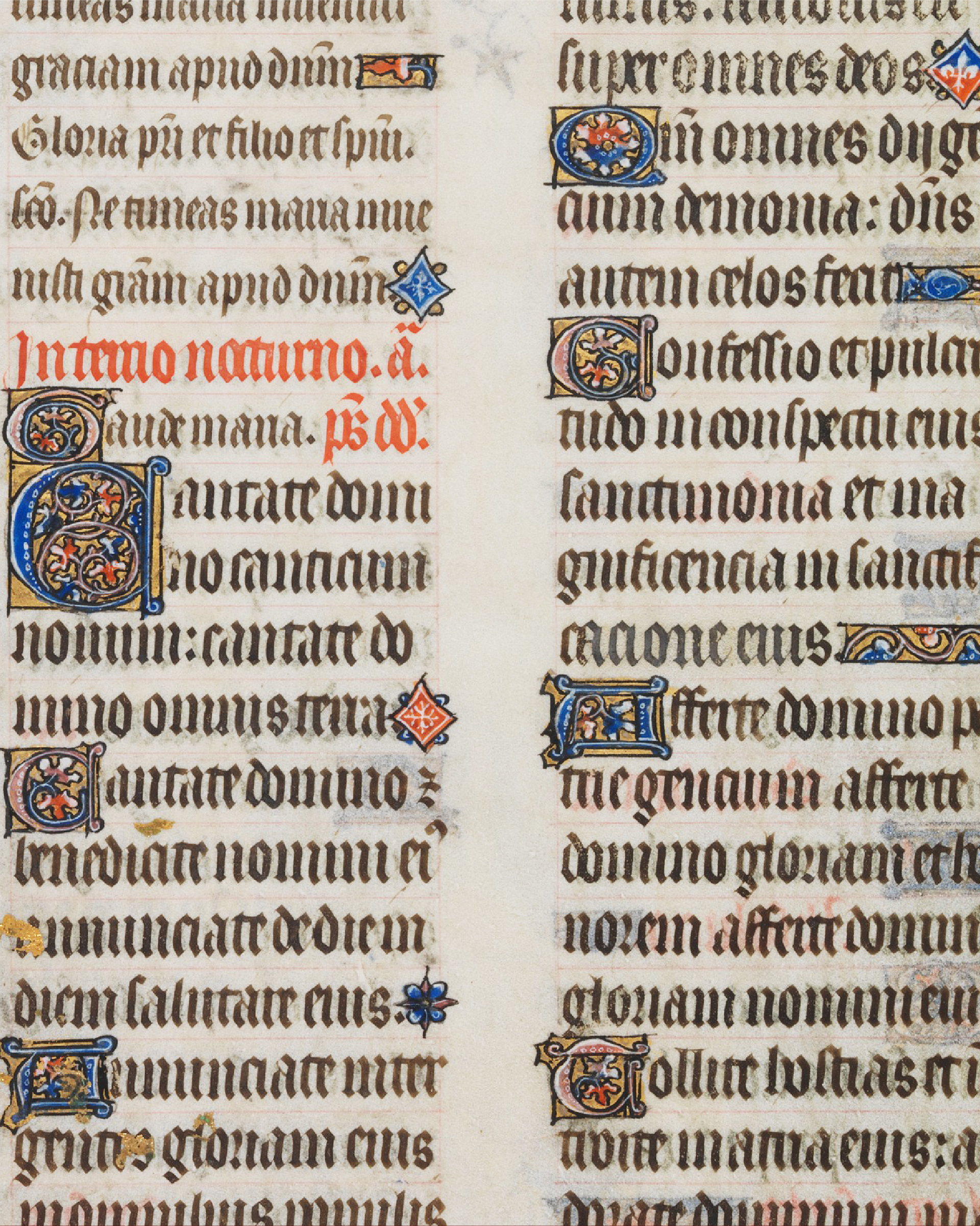
William Morris
British
1834–1896
Kelmscott Press
Visit

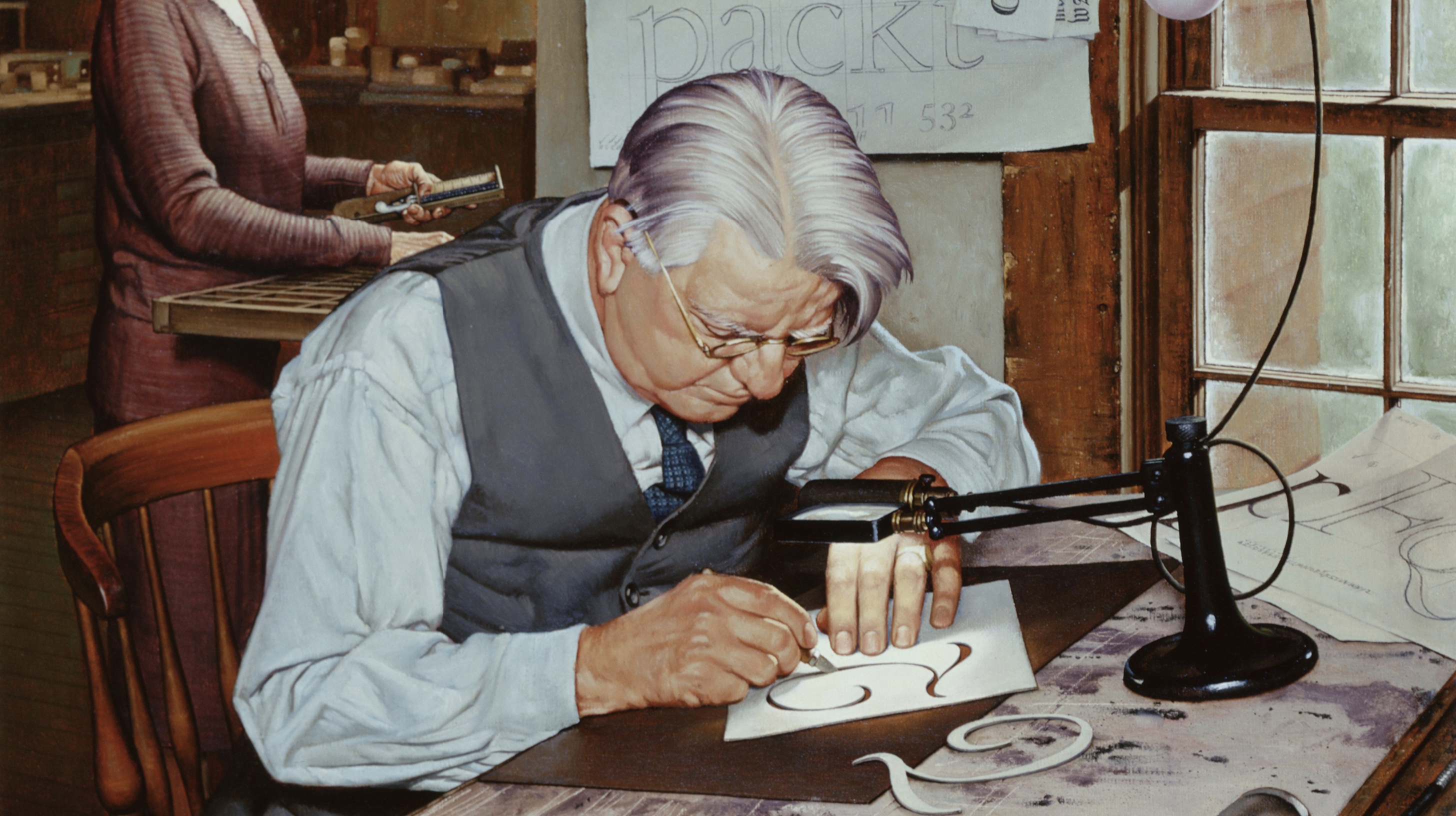
Firmin Didot’s typefaces defined the crisp, elegant aesthetic of modern typography. His high-contrast, neoclassical Didot typeface revolutionized book printing, blending mathematical precision with artistic grace. Its enduring influence shapes luxury branding, editorial design, and the timeless pursuit of typographic perfection.
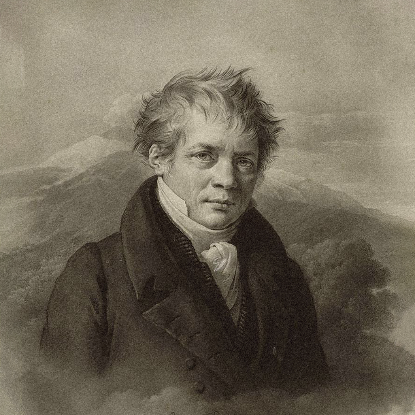
Firmin Didot (1764–1836) was a French printer, engraver, and type designer from the illustrious Didot family, a dynasty synonymous with typographic innovation. Born in Paris, he joined the family’s printing firm, where he refined punch-cutting techniques and developed the Didot typeface. This typeface, with its sharp serifs and dramatic contrast, became a hallmark of the French Revolution era’s printed works, elevating books and official documents to new standards of clarity and beauty. Firmin also pioneered stereotyping, a printing process that lowered costs and expanded access to books. Didot's work was highly sought after—he was eventually appointed by Napoleon as the director of the Imprimerie Impériale typefoundry. His work influenced global typography, with Didot fonts still iconic in fashion, publishing, and design. He died in Paris in 1836, leaving a legacy that continues to inspire type designers worldwide.
At a Glance
Behind every typeface is a journey. This story map traces the events, relationships, and ideas that shaped the designer’s life and work.